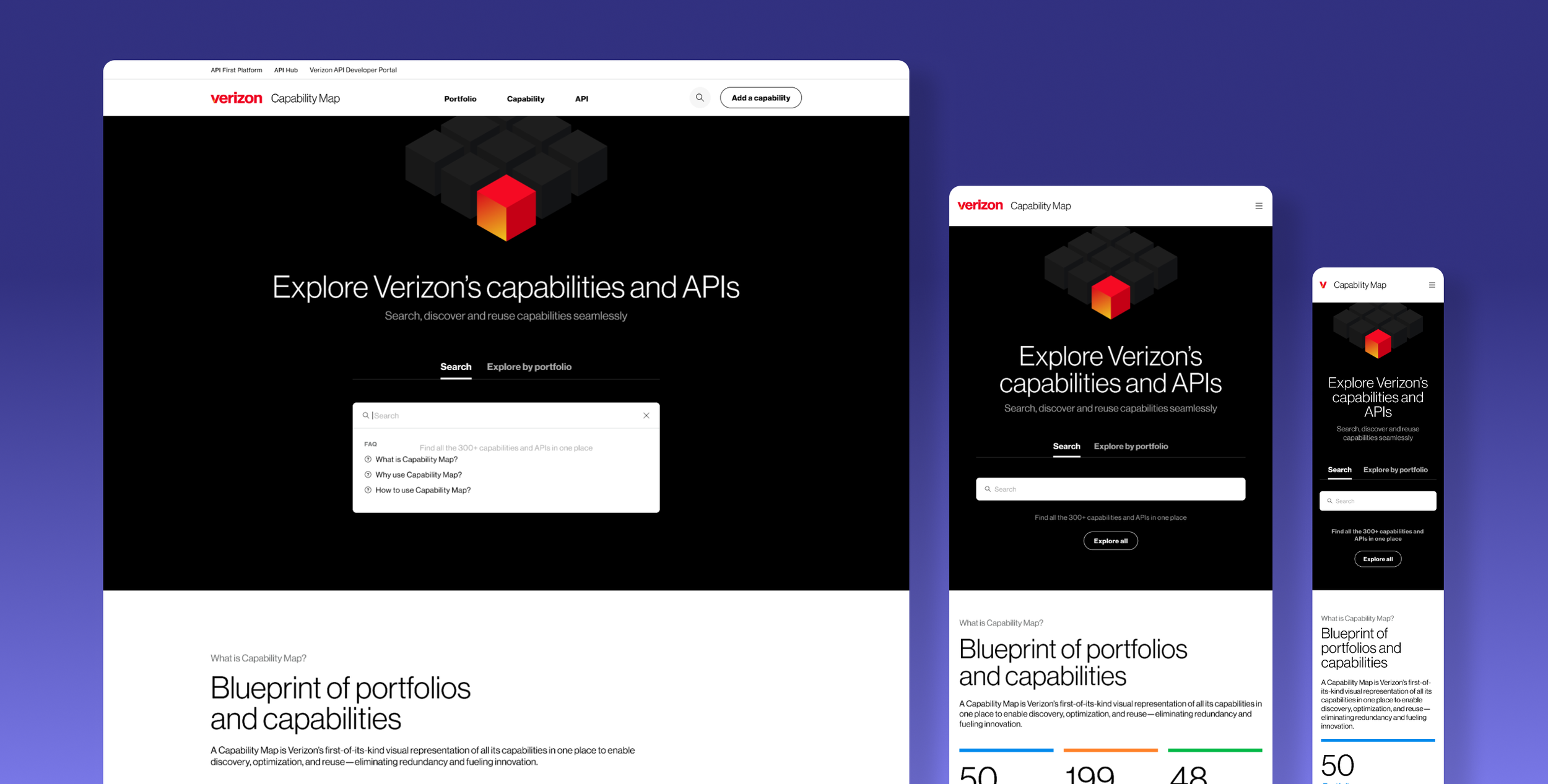
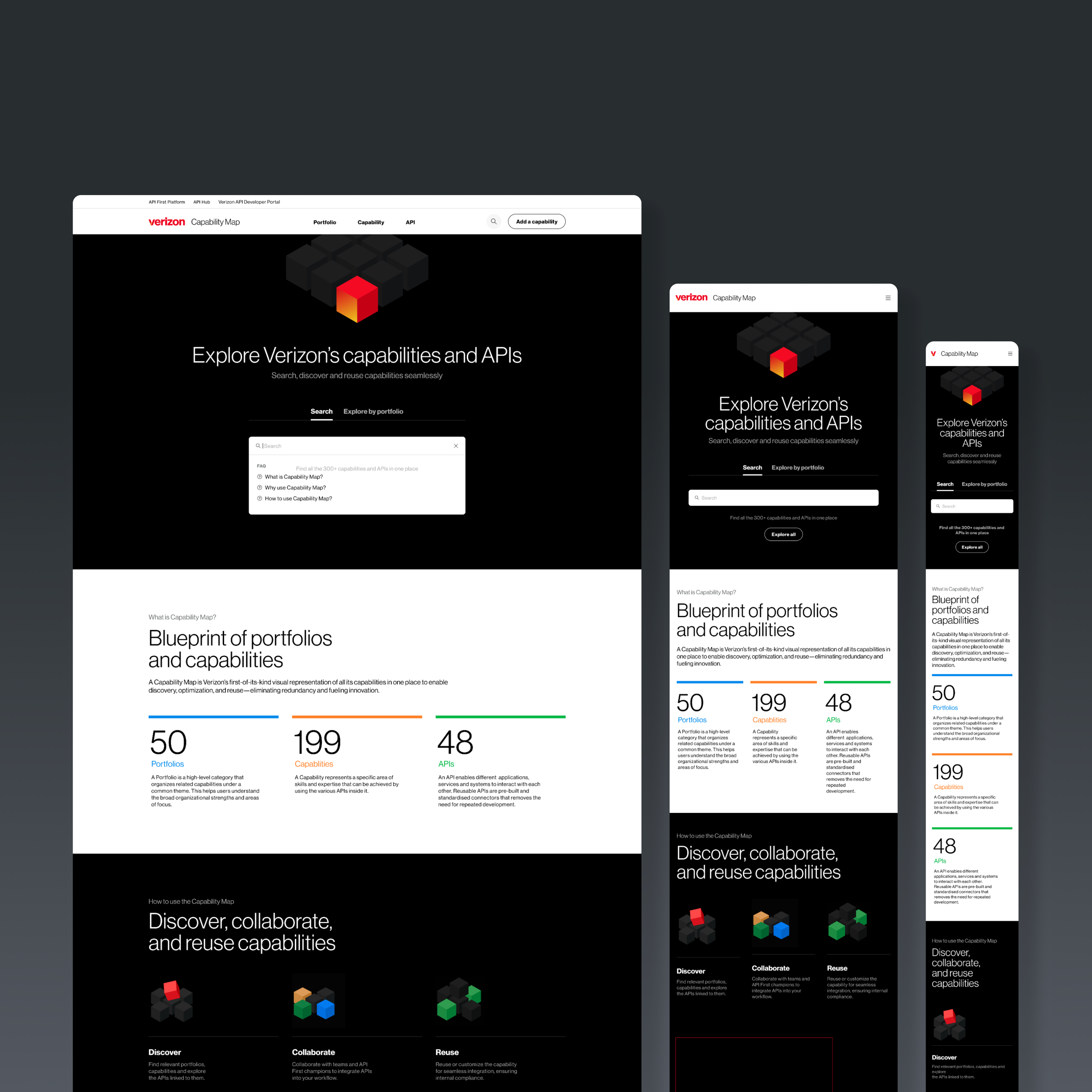
Capability Map:
the end of Redundancy
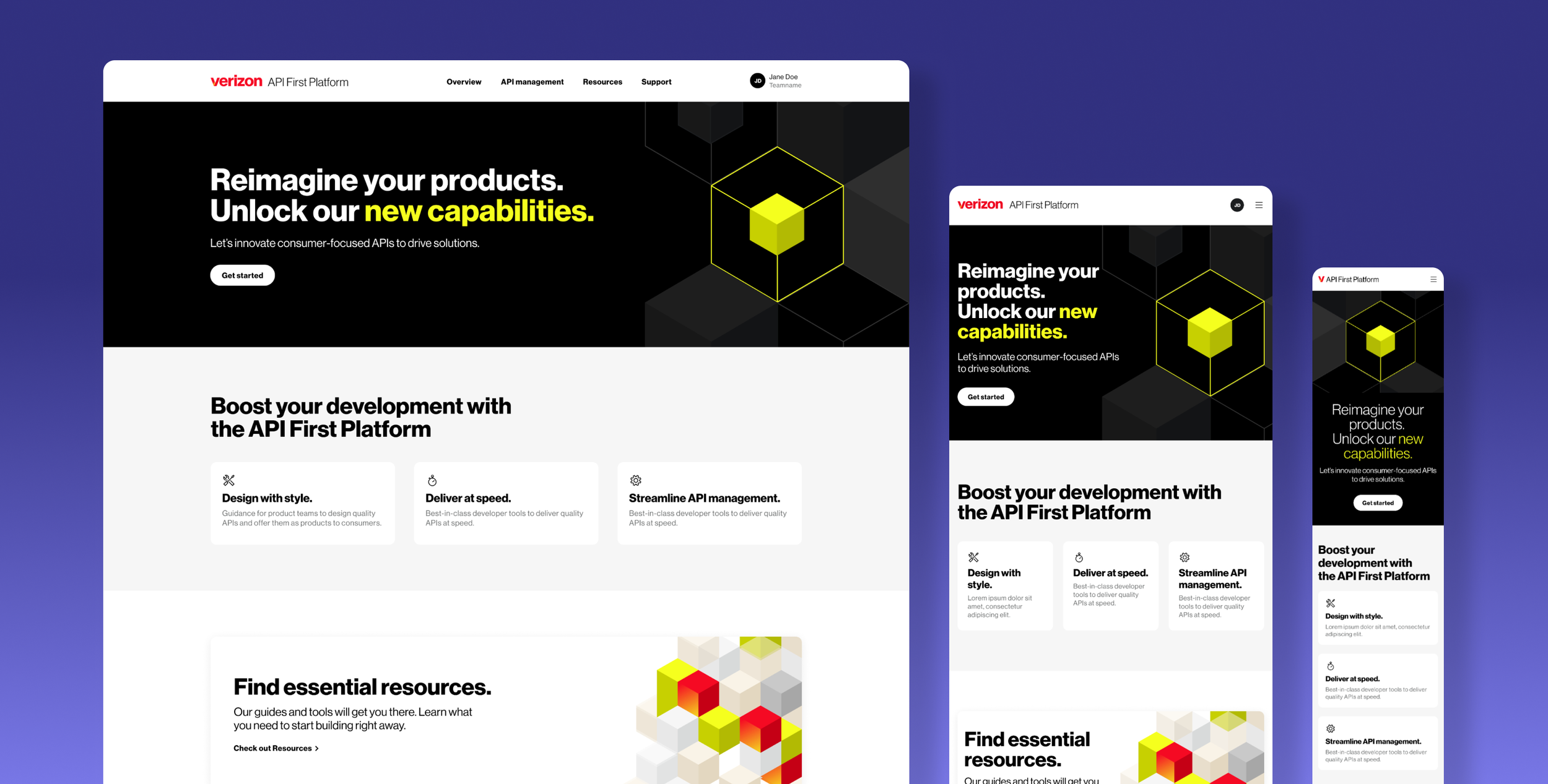
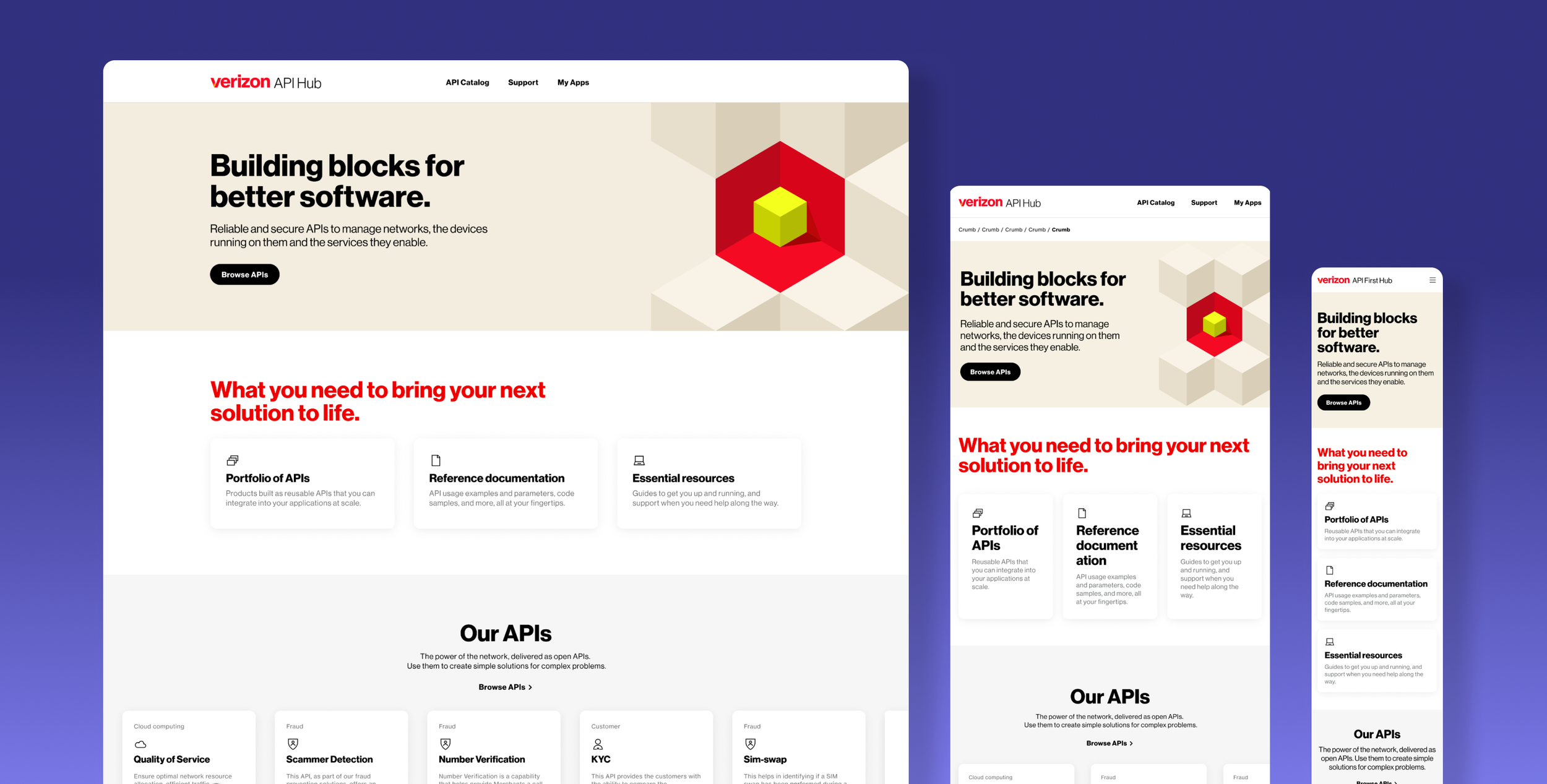
Verizon's API ecosystem was massive and nearly invisible. Teams spent months building tools that already existed - they just had no way to find them. I proposed a solution borrowed from a different discipline entirely: cartography. The Capability Map applies z-layered mapping principles to technical architecture, giving every developer a visual, explorable index of what Verizon had already built - and making reuse the obvious choice.
30-second Project summary
Your time is important to me and you look at a million of these every day… So here's a quick summary of the work I did on the Capability Map.
Problem:
Engineering teams operated in silos, rebuilding APIs that already existed elsewhere in the company - not because they were lazy, but because there was no way to know what existed.
Approach:
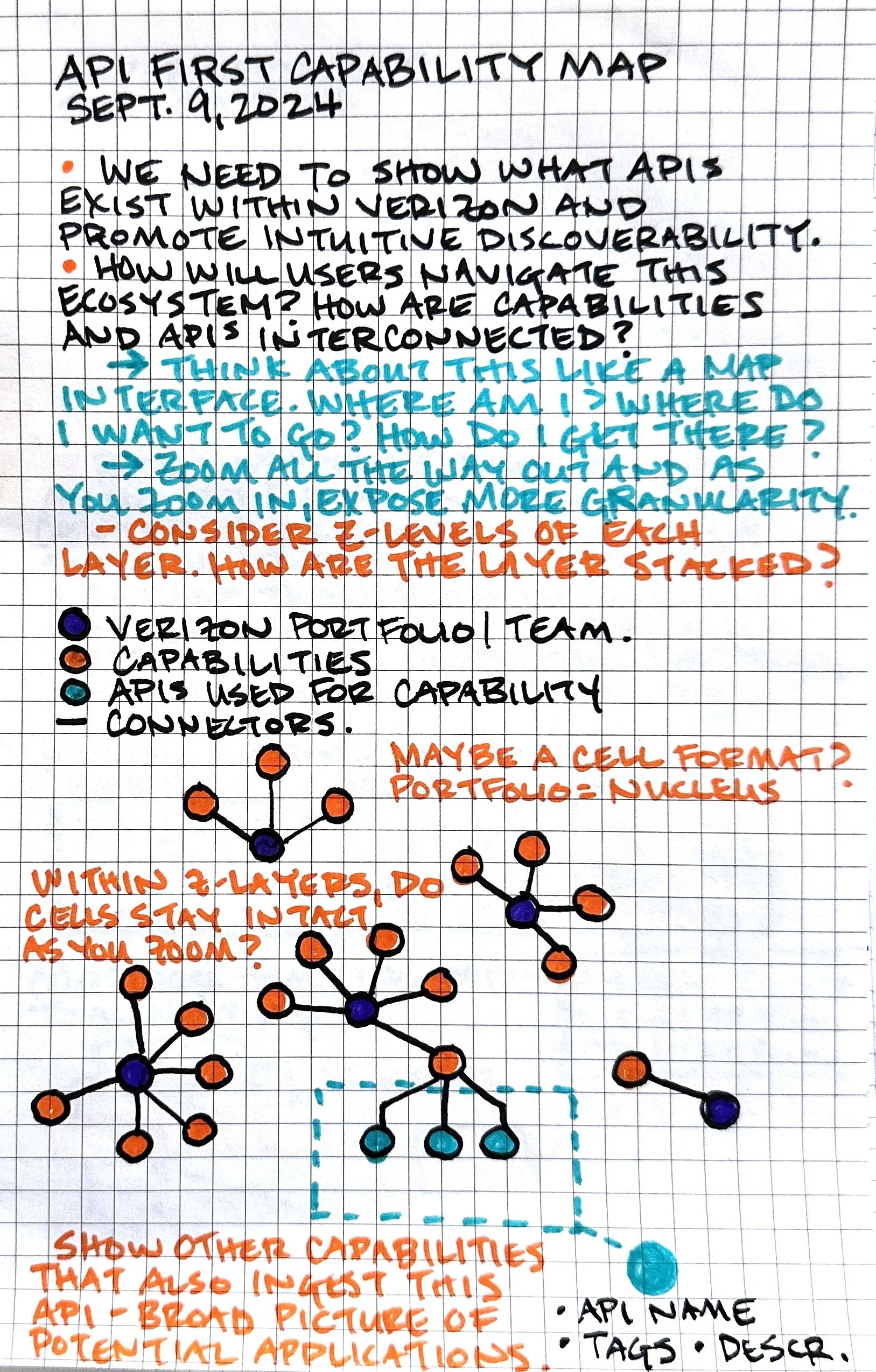
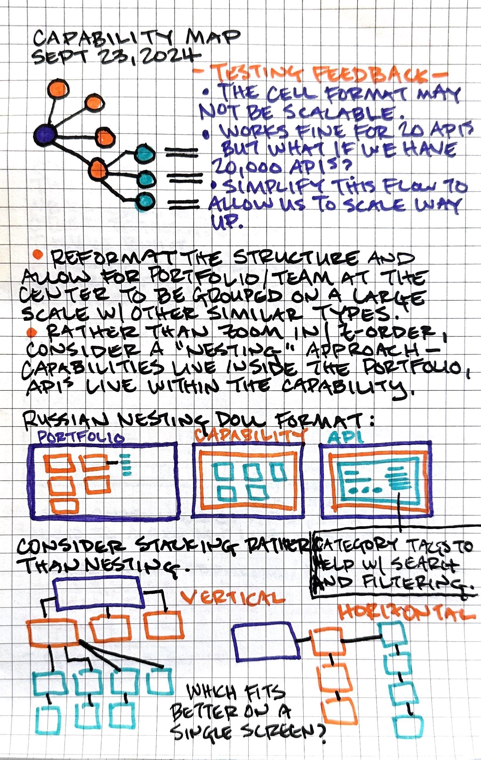
I designed a visual mapping system using cartographic z-layering to organize Verizon's full API ecosystem by portfolio, capability, and individual API - with a direct search-to-access workflow built in. Taxonomy was validated through card-sorting with real developers.
Business Result:
Project kick-offs accelerated by 600% through instant asset discovery. Eliminated an uncountable number of redundant API builds across the enterprise.
My Leadership contributions:
Lead Product Designer - Owned full-lifecycle design of the Capability Map, from concept through launch
Scalable IA - Established the taxonomy architecture (Portfolio → Capability → API) with future-proofing for hundreds of thousands of assets
User Research - Conducted stakeholder interviews, developer shadowing, card sorting, and journey mapping
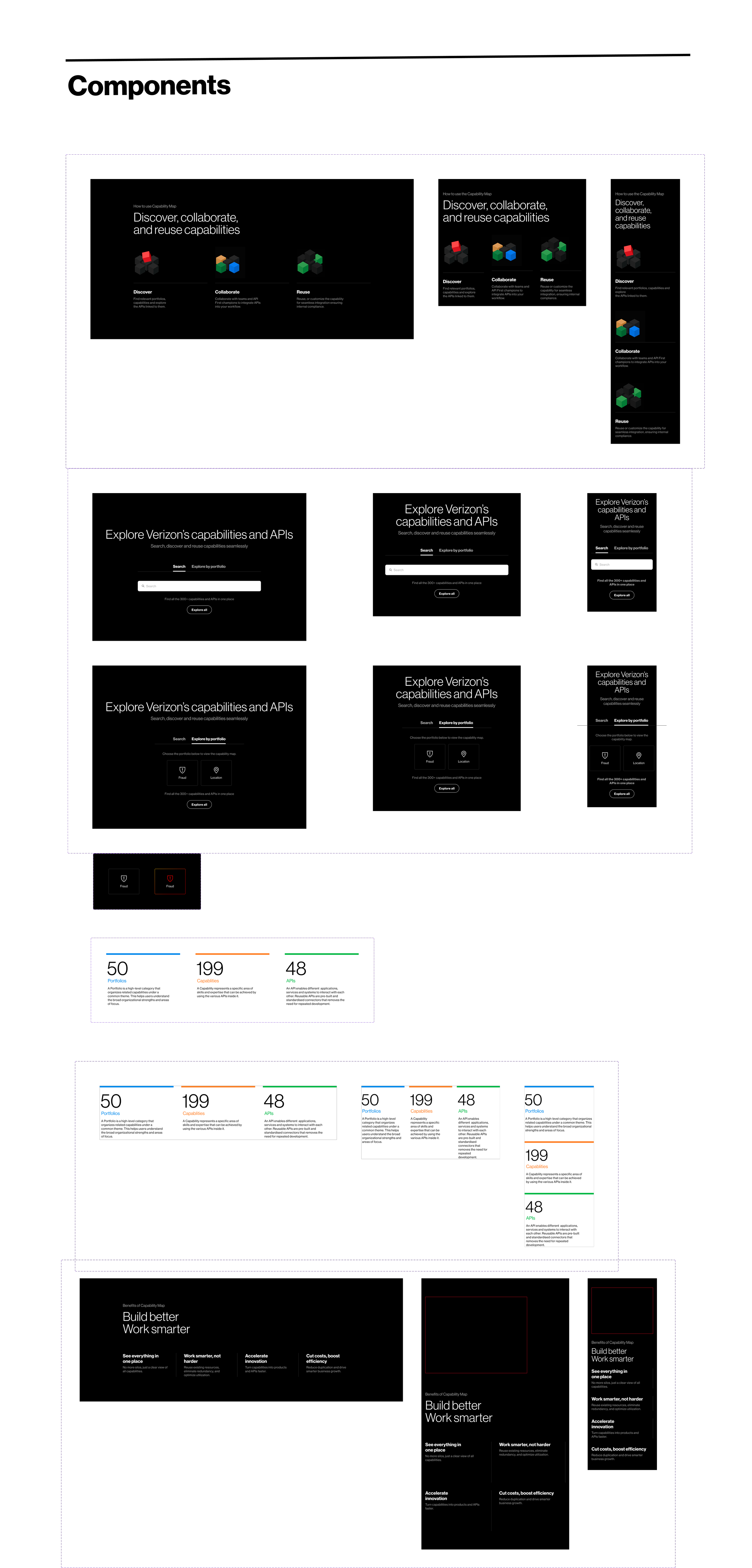
Component Design - Built a specialized UI component library including status badges, versioning toggles, and technical spec drawers
Cross-Functional Collaboration - Partnered with software architects and back-end teams to maintain data integrity across the UI
Art Direction - Directed production of brand-aligned animations and illustrations
The problem:
At enterprise scale, the biggest barrier to innovation isn't technical complexity - it's accidental duplication. Verizon's API ecosystem was extensive but opaque, and teams paid for that opacity constantly.
The Transparency Gap - Tribal knowledge lived in Slack threads and email chains, not anywhere searchable.
The Reinvention Tax - Engineering teams spent months rebuilding capabilities that already existed, simply because they couldn't see what was available.
The Consistency Cost - Without a central reference, architectural standards drifted across teams, compounding technical debt over time.
The Mission:
The mission of the Capability Map is to eliminate the "build vs. reuse" dilemma by providing a centralized, exploratory lens into the enterprise's technical assets—transforming siloed tribal knowledge into a transparent, scalable mapping system that reduces technical debt and accelerates speed-to-market.
“Ryan is an incredibly dynamic and charismatic UX Designer, bringing an inspired energy and eagerness to every collaboration. His work on internal evangelization and content delivery for the Verizon API portals was marked by his excellent team-player attitude and flexible nature. Ryan is not only research-minded but is continually striving to deliver the best possible design outcomes, making him a truly valuable and motivated asset to any UX team”.
Ivan Hollander
Associate Director, Product Engineering and Design - Verizon
The Design Concept:
Most enterprise data tools solve the visibility problem with search bars and tables. I took a different approach.
I'd spent years building cartographic systems that make complex spatial data navigable at a glance. The same principles apply to an API ecosystem: you have assets at different levels of abstraction, relationships between them, and users who need to orient themselves quickly in an unfamiliar landscape.
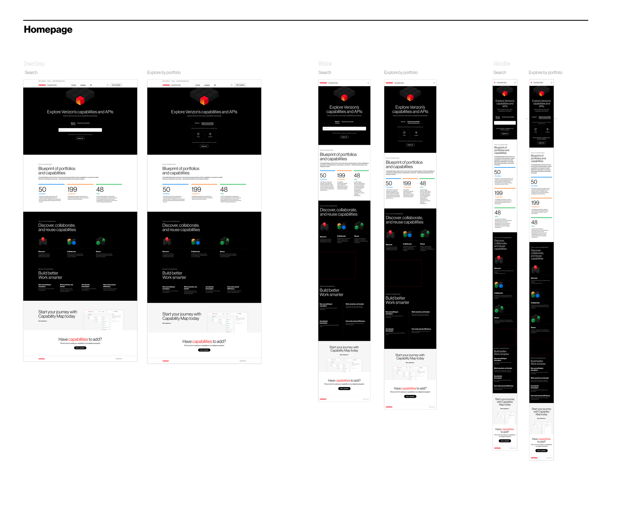
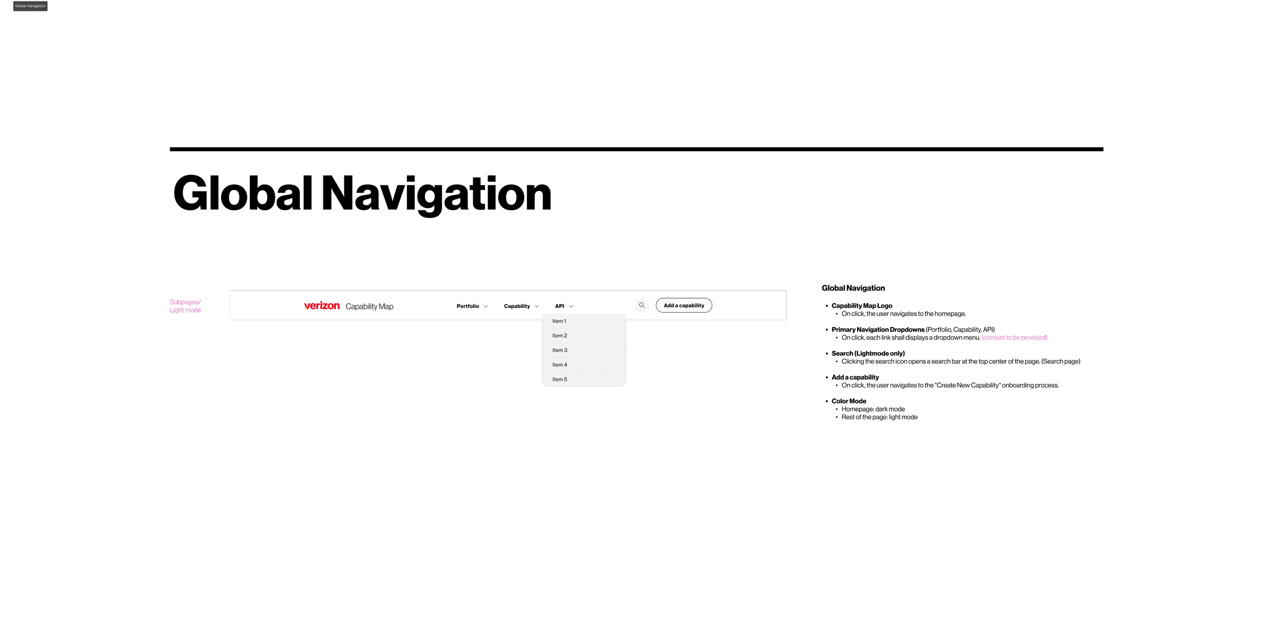
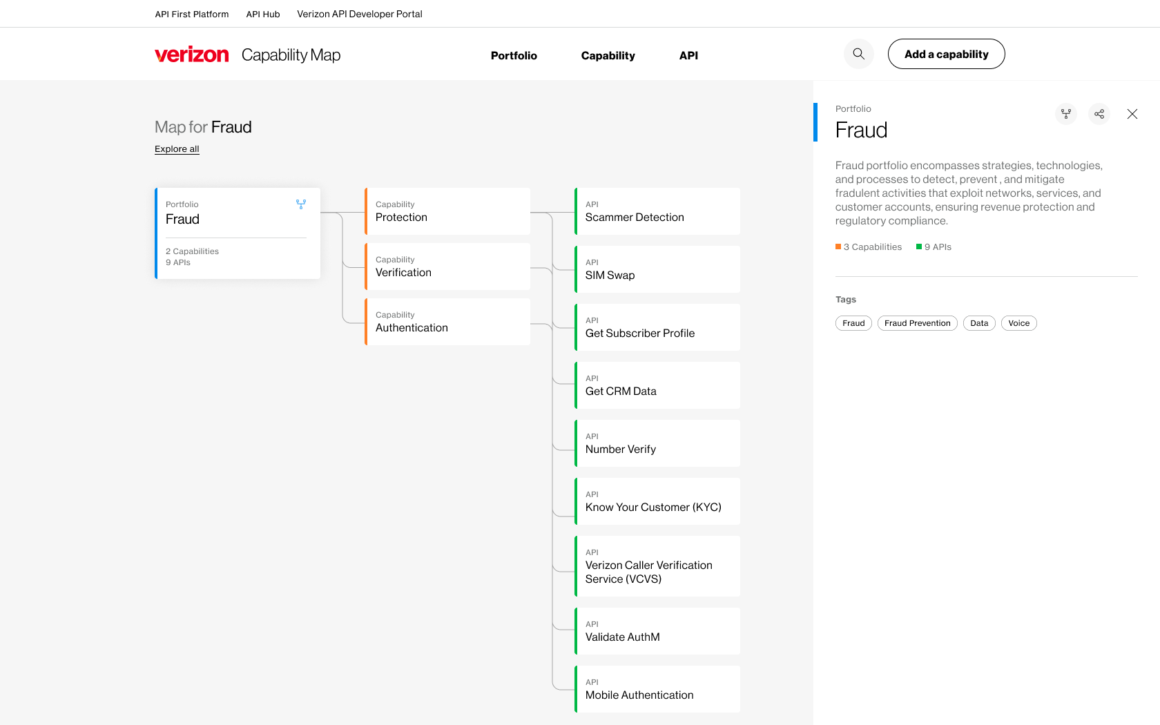
I designed the Capability Map using cartographic z-layering - stacking the taxonomy across three tiers: Portfolios (the business domain), Capabilities (the functional grouping), and APIs (the individual assets). Each layer drills deeper without losing context of where you are. Developers could browse from the top down or search from the bottom up. Either way, they always knew what they were looking at and how to get access.
User research:
Stakeholder interviews with Engineering Directors and Product Leads to define success metrics and quantify the cost of redundancy
Developer shadowing - observed engineers navigating the existing toolchain in real conditions to find where discovery broke down
Information mapping of informal knowledge channels (Slack, email, word-of-mouth) to identify where a formal tool was most needed
Card sorting with developers to determine the taxonomy that felt intuitive - business unit vs. technical stack vs. functional capability (functional capability won)
Competitive analysis of external API marketplaces like Stripe and Twilio vs. internal legacy tools, to understand why existing systems failed to encourage reuse
Prototyping:
Flow diagrams and wireframes to establish the search-to-access journey, focused on minimizing steps between discovery and a live endpoint
Taxonomy and schema design - collaborated with Lead Architects to prototype the data structure for scale, ensuring the UI could handle thousands of APIs without becoming a wall of text
Figma interactive prototypes testing two navigation models: directory-style browsing vs. global-search entry - both needed to work, for different user modes
Specialized component library - built status badges (API health), versioning toggles, and technical spec drawers that integrated with Verizon's existing design system
WCAG accessibility review - validated color contrast for code blocks and keyboard navigability throughout the exploratory map
The Outcome:
The Capability Map became Verizon's single source of truth for technical asset discovery.
600% faster project kick-offs through instant API discovery
Eliminated redundant API builds enterprise-wide - teams could see what existed before they started building
Centralized tribal knowledge that had previously lived only in Slack threads and individual engineers' heads
Established a consistent architectural taxonomy across all business units for the first time
When reuse is frictionless, it becomes the default. The Capability Map didn't just reduce redundancy - it changed how teams thought about building.
Check it out!
Capability Map Prototype:
The prototype covers the full discovery and access flow - browse by portfolio, drill into capabilities, and request access to a live API.
Expand the window for the full experience.
See More Product Design case studies