Safe Stride
Mapping Safety & Community
Most navigation apps optimize for speed. SafeStride optimizes for safety - specifically, for the women who pause to think twice before a solo run through an unfamiliar neighborhood.
I founded and built SafeStride as a mobile mapping and community platform that combines real-time incident data, biometric identity verification, and a privacy-preserving reporting system. It's designed to help women reclaim public spaces for running, cycling, and community meetups.
Role: Founder / Lead Product Designer & Engineer
Tools: React Native, Mapbox, Supabase, PostGIS, Veriff
Overview:
In major urban centers like Las Vegas and Denver, personal safety is a primary barrier to physical activity. While municipal crime data exists, it is rarely actionable or human-centric. SafeStride is a specialized mapping and community platform designed to bridge the “anxiety gap." It synthesizes real-time incident data with a verified, female-only social layer to help women reclaim public spaces for running, cycling, and community meetups.
Problem:
Bridging the Urban Anxiety Gap
For many women in urban centers, the question isn't "what's the fastest route" - it's "what's the safest one." Existing tools don't answer that. Three specific gaps defined the design brief:
The Data Void - Municipal crime data exists but it's static, lagged, and impossible to act on in real time.
The Trust Deficit - Community safety features on public apps are easily gamed by bad actors. "Community" only works if the community is verified.
The Privacy Paradox - To report an incident, a user has to reveal their location - creating a new vulnerability in the act of trying to protect others.
How it works:
Leveraging cartographic experience and an API-first mindset, the solution focused on three interlocking design decisions:
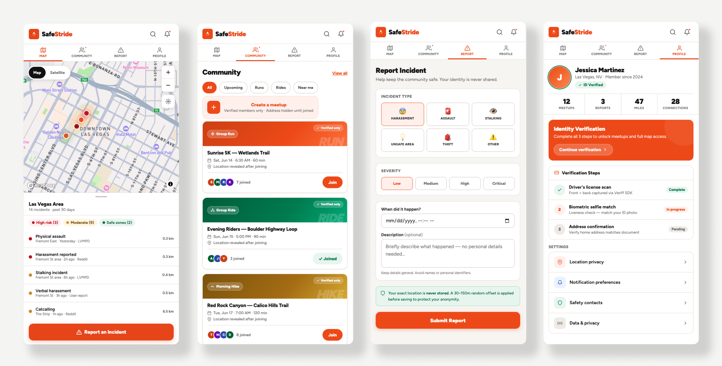
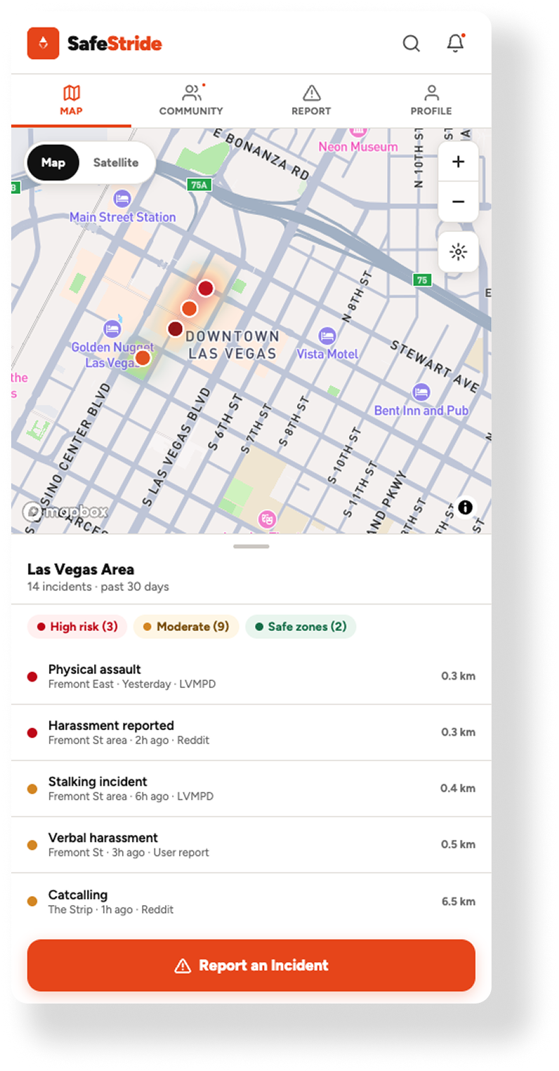
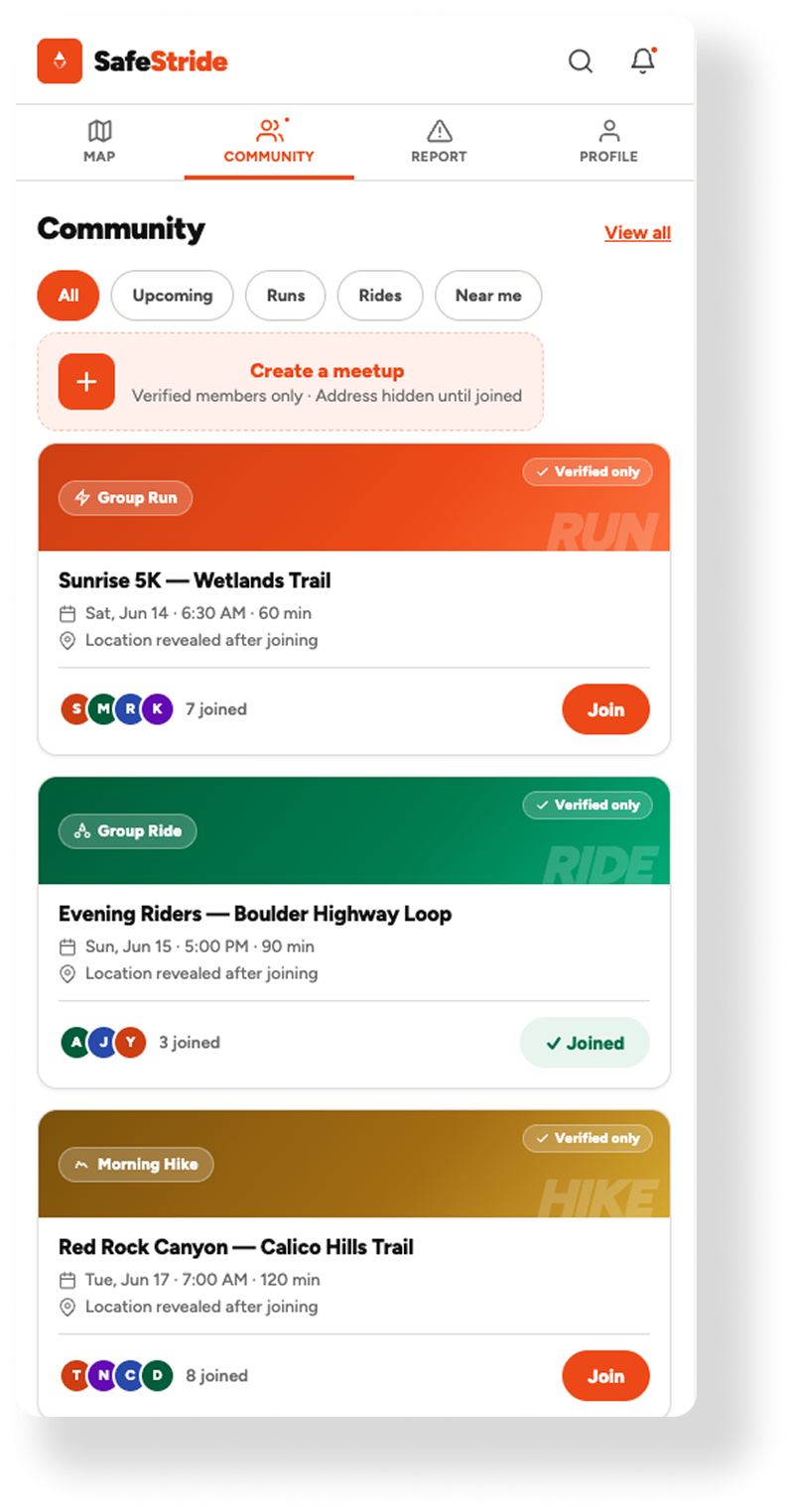
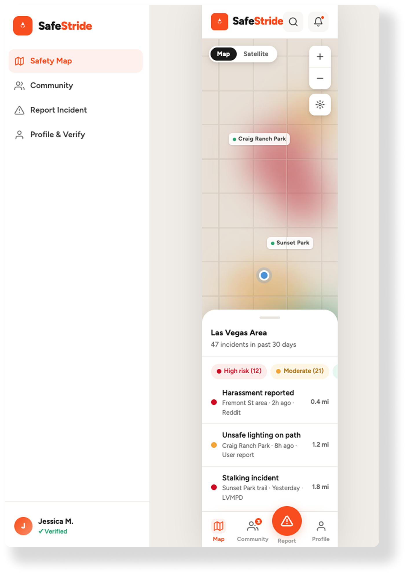
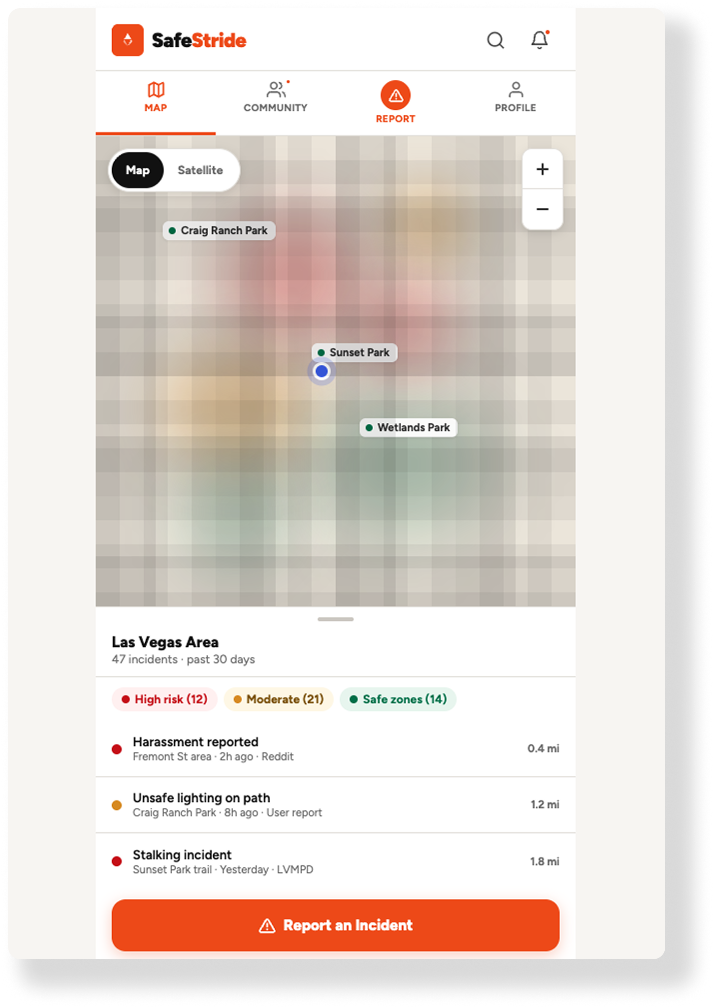
1. Human-Centric Cartography I designed a minimalist Mapbox interface around "cognitive ease" - not data density. Using PostGIS, SafeStride aggregates municipal CAD (Computer Aided Dispatch) feeds and community reports into a dynamic heatmap layer. Repeat incidents surface at a glance without the clutter of individual map markers. The goal: a woman glancing at her phone before a run can read the map in under 5 seconds.
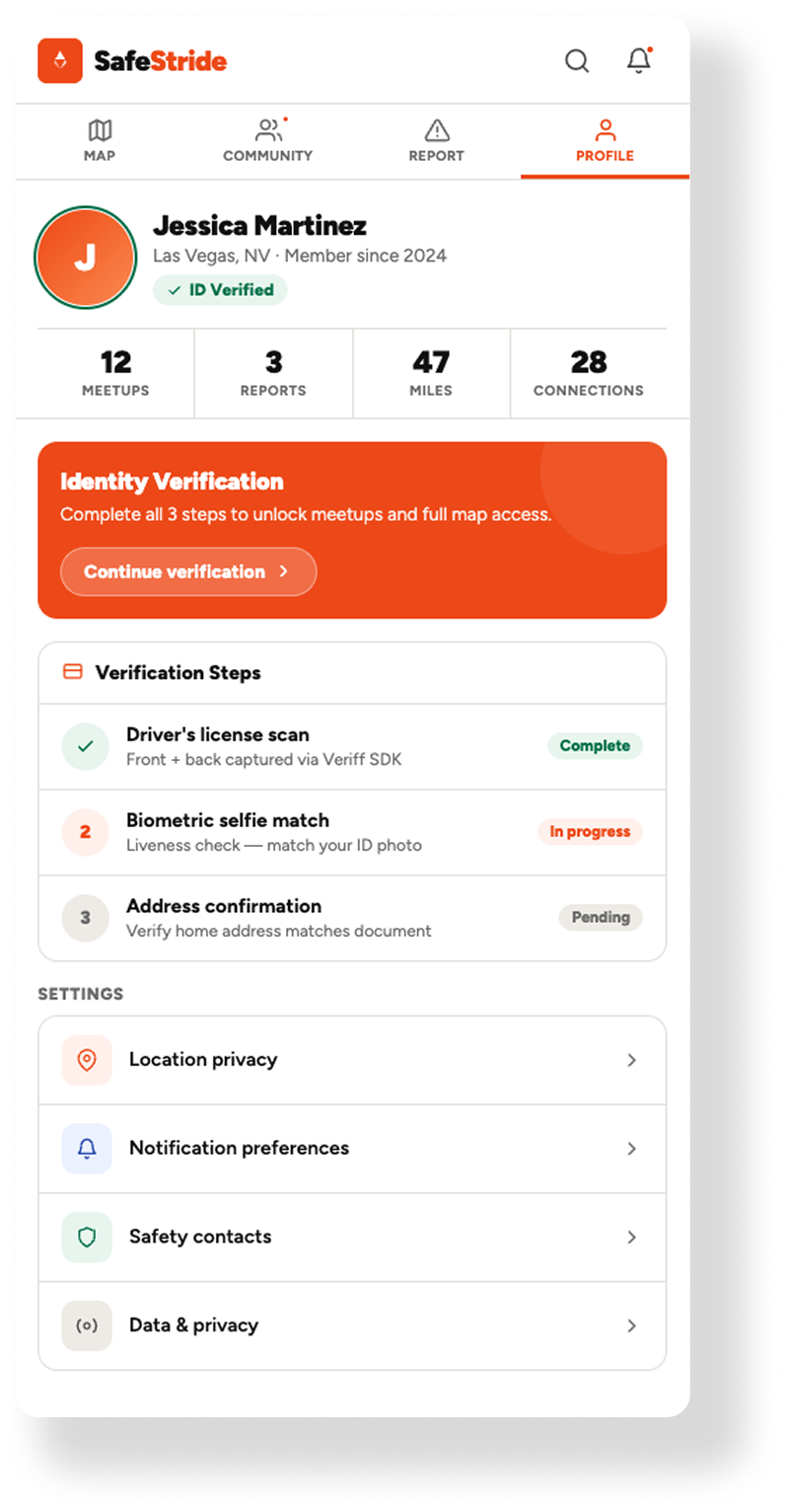
2. The Biometric Gate To solve the trust problem, I made onboarding deliberately high-friction. SafeStride uses fintech-grade biometric verification (document scan + live selfie match) to enforce a 1:1 human-to-account ratio. No bots. No bad actors. The friction isn't a bug - it's the entire trust model. A community is only as safe as its vetting process.
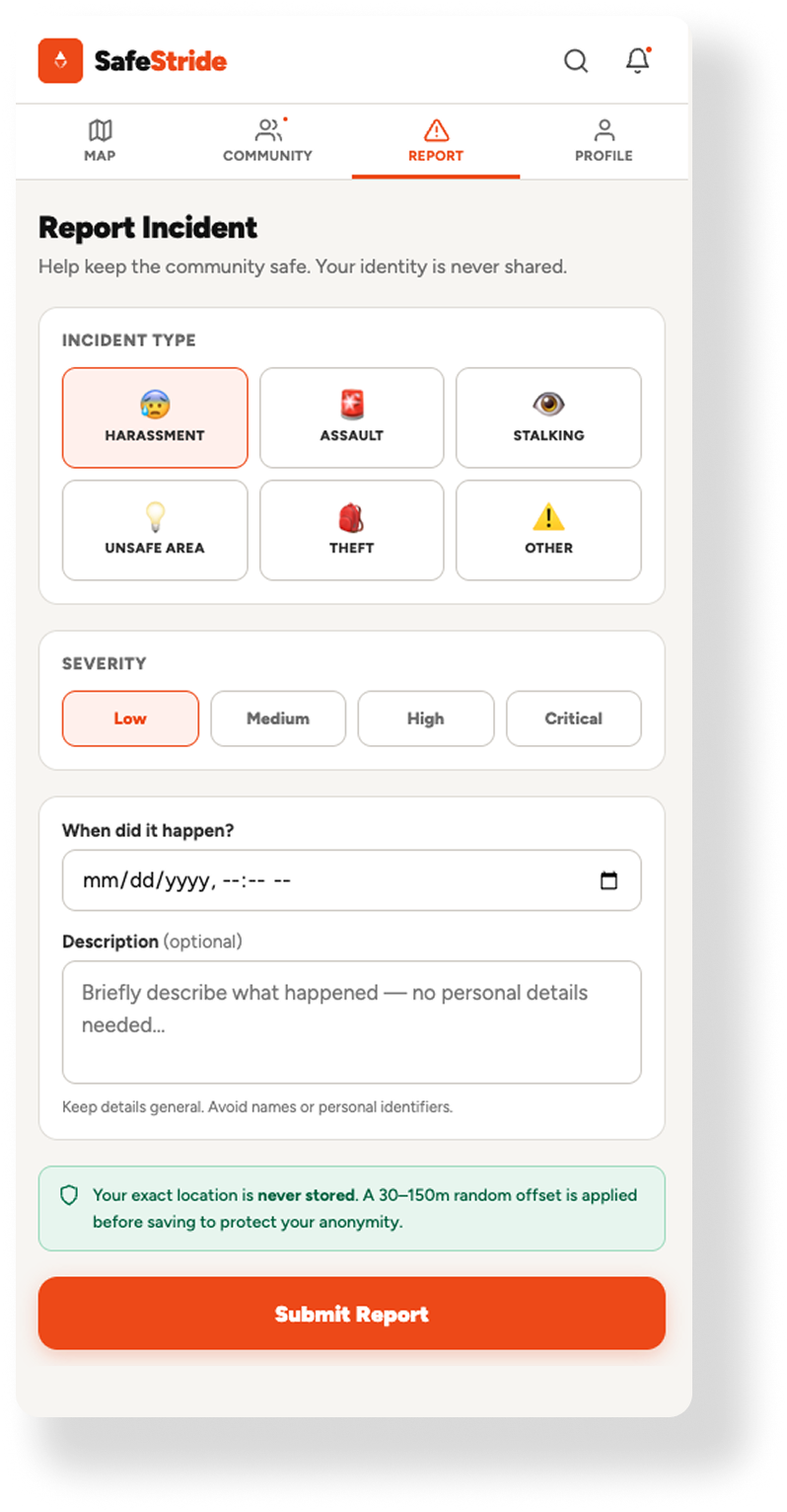
3. Location Jittering The privacy paradox required an engineering solution. I built a Location Jittering API that applies a random 50–100 meter spatial offset when a user reports an incident. The community heatmap stays accurate. The reporter's exact location stays private. Protection without exposure.
What I Learned:
Trust is a design choice!
Cartography isn't just about where things are - it's about how people feel when they're there. That realization shaped every design decision on SafeStride, from the minimalist map interface to the deliberate friction of biometric onboarding.
The other takeaway: friction is a feature when the stakes are right. Modern UX often treats every extra tap as a failure. SafeStride taught me that sometimes a pause - a moment that says we take this seriously - is exactly what earns user trust.
The Outcome:
1:1 verified human-to-account ratio - zero bots, zero bad actors in the community layer
Scalable spatial pipeline processing thousands of geo-localized incidents monthly across Las Vegas and Denver
Location Jittering API providing 100% reporter anonymity while maintaining heatmap accuracy
Mobile-first architecture designed for iOS/Android HIG compliance throughout
Working With AI: Where It Helped and Where It Didn't
AI accelerated this project significantly - until it didn't. Two failure modes required senior-level intervention and reshaped how I think about human-AI collaboration in product development.
1. The Mobile vs. Web Context Gap
Despite explicit instructions that SafeStride was a mobile-first native application, the first iteration of the UI architecture from Claude was fundamentally flawed. It attempted to force-fit a web-based navigation logic, complete with a complex left-hand sidebar, into a mobile viewport.
The Failure: AI often defaults to the most common training data (web patterns) rather than adhering to specific platform constraints (iOS/Android HIG).
The Correction: I had to pivot from broad conceptual prompts to System-Level Component constraints, manually stripping out the desktop-centric code and realigning the app with a mobile design system.
2. The Mapbox Rendering Struggle
The most complex technical hurdle remains the integration of dynamic Mapbox tiles. Despite multiple prompt iterations, the AI consistently struggled with the nuances of Vector Tile rendering and layer initialization within the React Native lifecycle.
The Failure: Every iteration introduced a new glitch - from flickering heatmaps to failed POI label inheritance. This is a classic example of “AI Hallucination" in complex documentation; the model would suggest outdated or mismatched prop syntax for the @rnmapbox/maps library.
The Strategy: Because the stakes of a safety app are too high to rely on “guessed" code, this phase transitioned from AI generation to Manual Documentation Review. Getting the map engine right requires a surgical approach to the Mapbox API that GenAI isn't yet capable of mastering on its own.
See More AI-Orchestrated APPS